As a designer, I don’t think there’s any better feeling than “cracking” the idea behind a really smart logo concept. Through the years, I’ve been trusted by dozens of companies, organizations, events, and individuals to design logos to represent them. Below is a small collection of those logos.
While not every logo concept lends itself to this approach, when it makes sense, I like to sneak in a little special sauce – some hidden ideas or messages hiding in plain site within the logo. I think these sort of highly intentional design choices really add to the value of the underlying concept, and if nothing else, they’re fun bits of trivia for an organization to know about their logo.
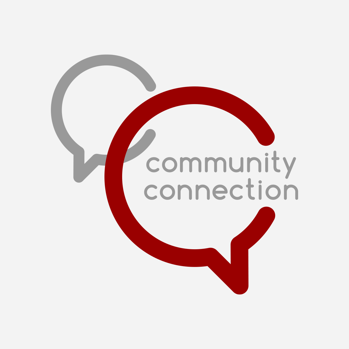
For the Community Connection logo, the relationship between the interlocking C-shaped speech bubbles was just screaming for for me to integrate some Golden Ratio goodness. So I integrated the ration in both the diameter of the inner circles and the thickness of the strokes.
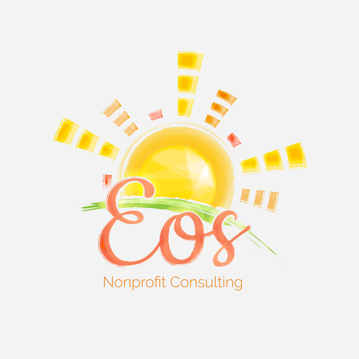
Eos Nonprofit Consulting was named after the Greek goddess of the dawn and patron of new beginnings. This is exactly what the company provides – new beginnings for struggling organizations. Incorporating a rising sun in the logo was a no brainer, but I was also taken by the similarities between the words and underlying meanings of Eos and SOS – the international Morse code distress signal. So I incorporated a visual reference to the Morse code for Eos (• ——— •••) as the segments that make up the sun rays.
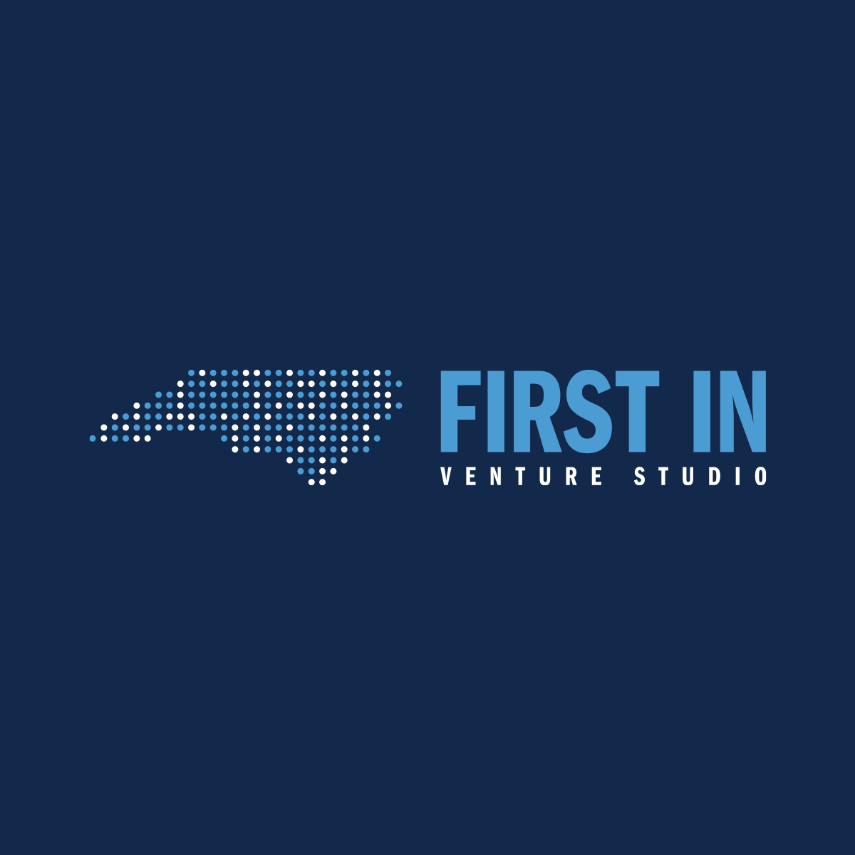
First In Venture Studio’s mission is focused on creating new tech-based startups, so I incorporated some messaging in the logo that only the nerdiest of nerds might be able to read – FIRST IN VENTURE STUDIO spelled out in binary.
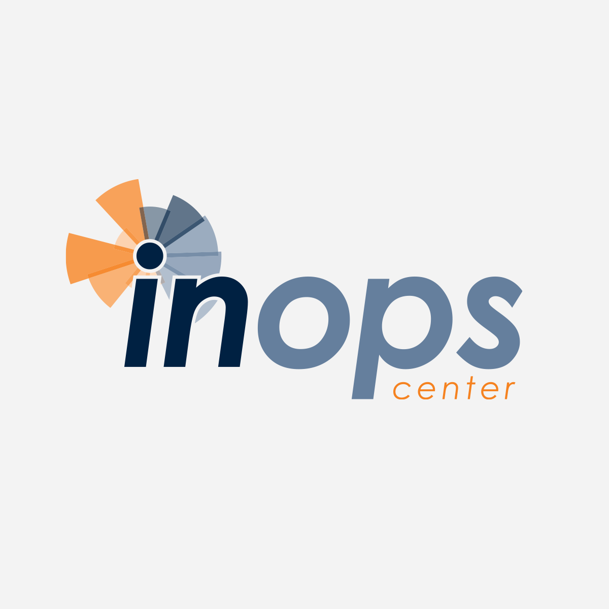
This logo was designed for a new Innovations and Operations Center (InOps Center for short) proposed by the Indiana state government. The vision of the center is to bring technologies together and leverage analytics to help the government run more efficiently. Since the center is focused on big data analysis, this design was inspired by data visualization. For the graphical element in the logo, each letter in “InOps Center” is represented by an equal segment of the ring, and each word is assigned a different base color (the same color used to present each word in the word mark). The height and opacity of each segment of the ring is determined by the letter’s position in the alphabet. For example, C is the third letter in the alphabet, so its height is three segments tall and the opacity setting is very low; while T is the 20th letter in the alphabet, so its segment is 20 segments tall and opacity is very high.
